Journal _
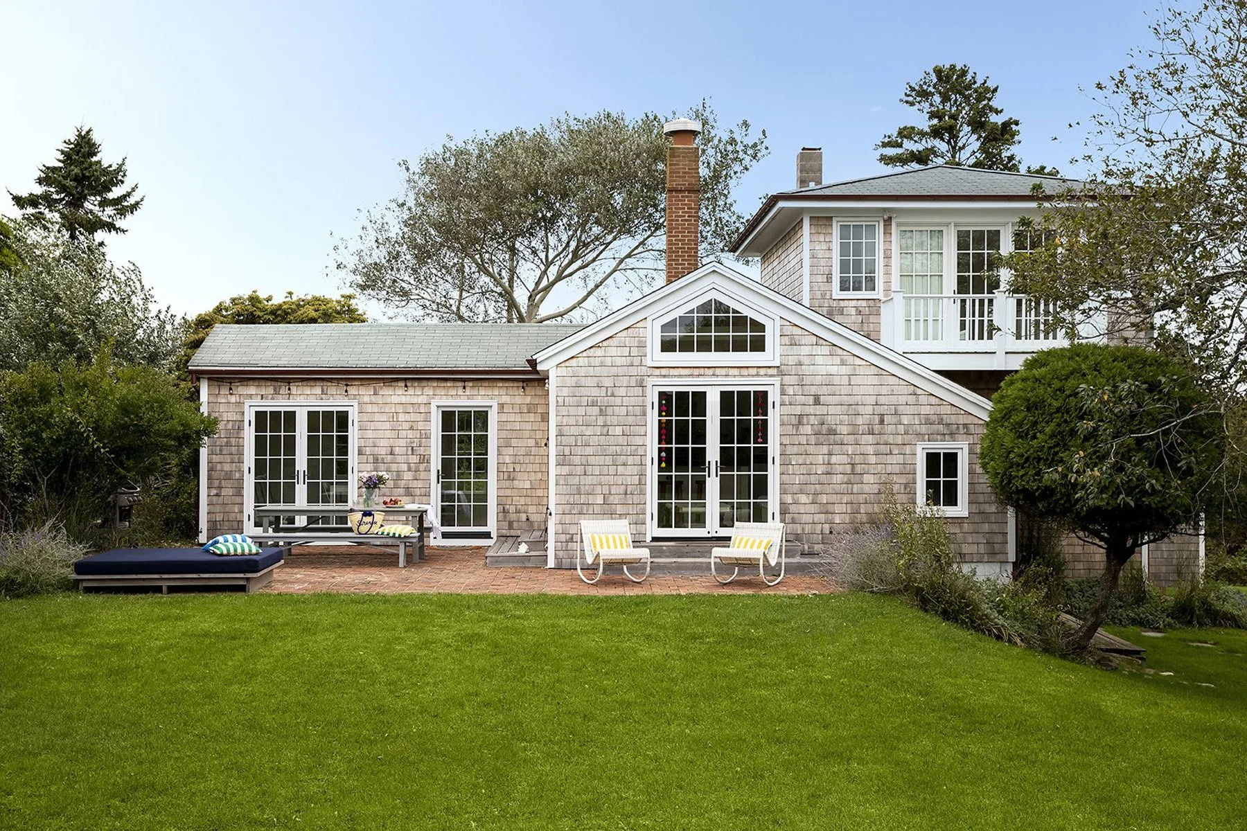
When to Hire an Interior Designer
The designer is the important piece of your puzzle that you are waiting to determine until it’s way too late. At Studio Ness, there are opportunities we can identify before purchasing that will make a huge impact on how the home functions for you.
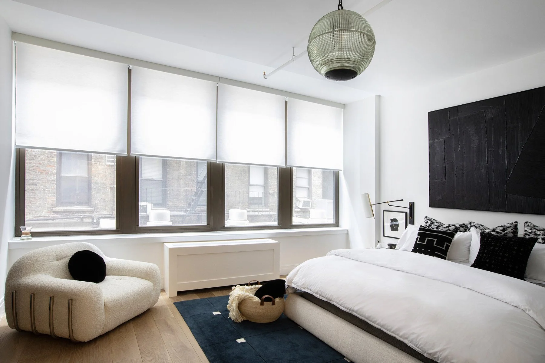
Maximizing ROI: Strategic Design Secrets for Small NYC Apartments
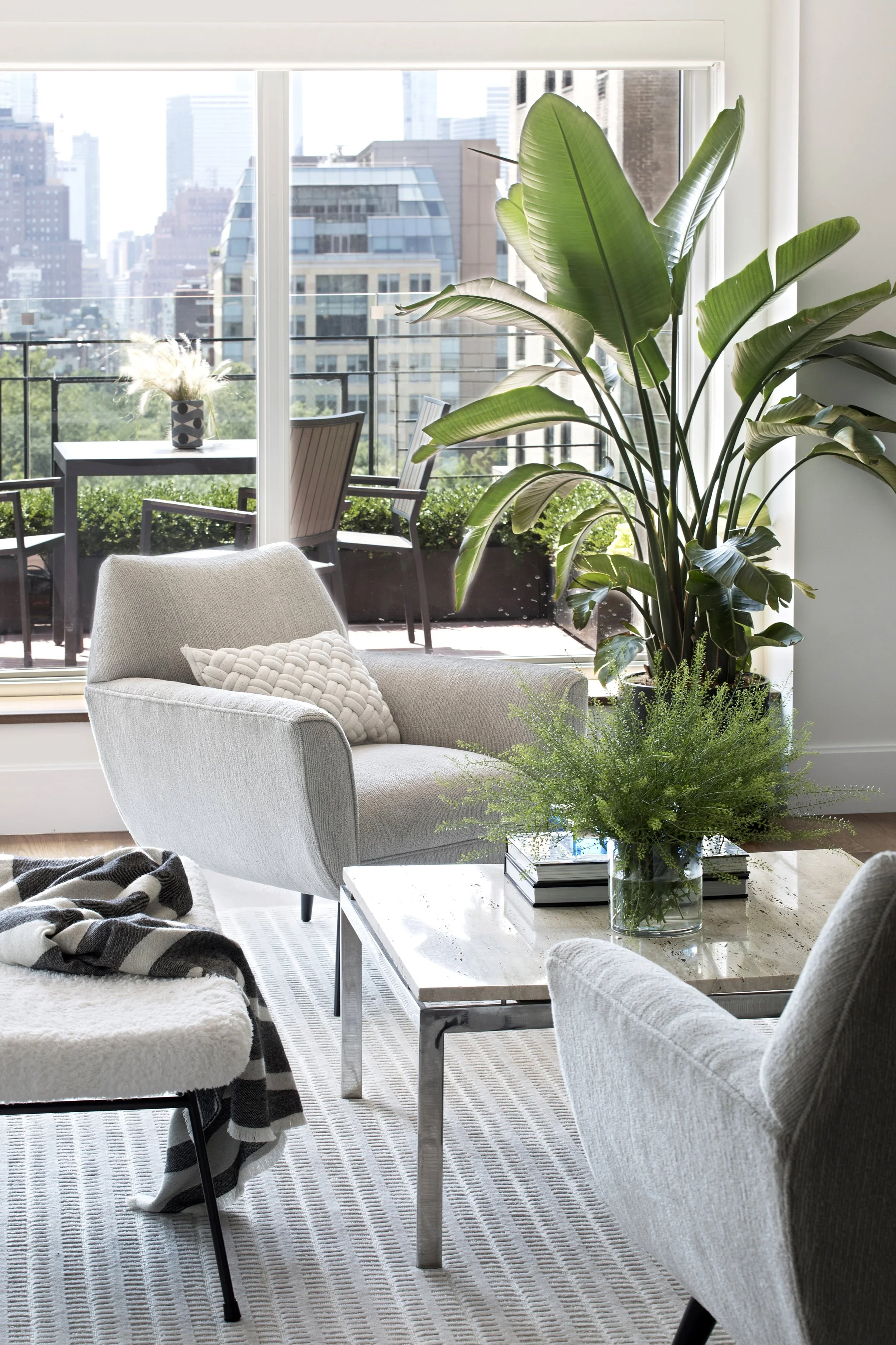
In New York City, every inch of space carries serious value, often exceeding $1,500 per square foot. So when it comes to your home, the question isn’t just how it looks, but how it performs as an investment.
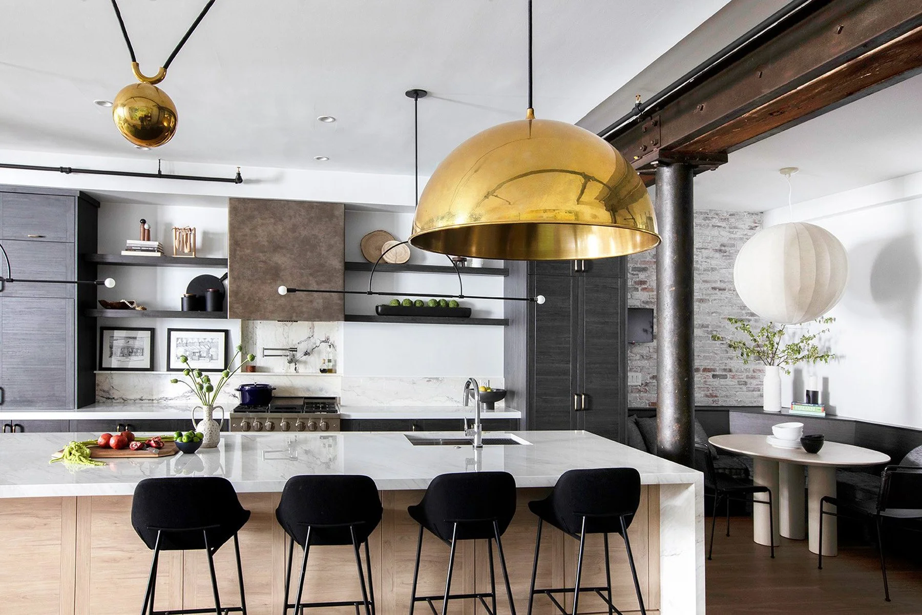
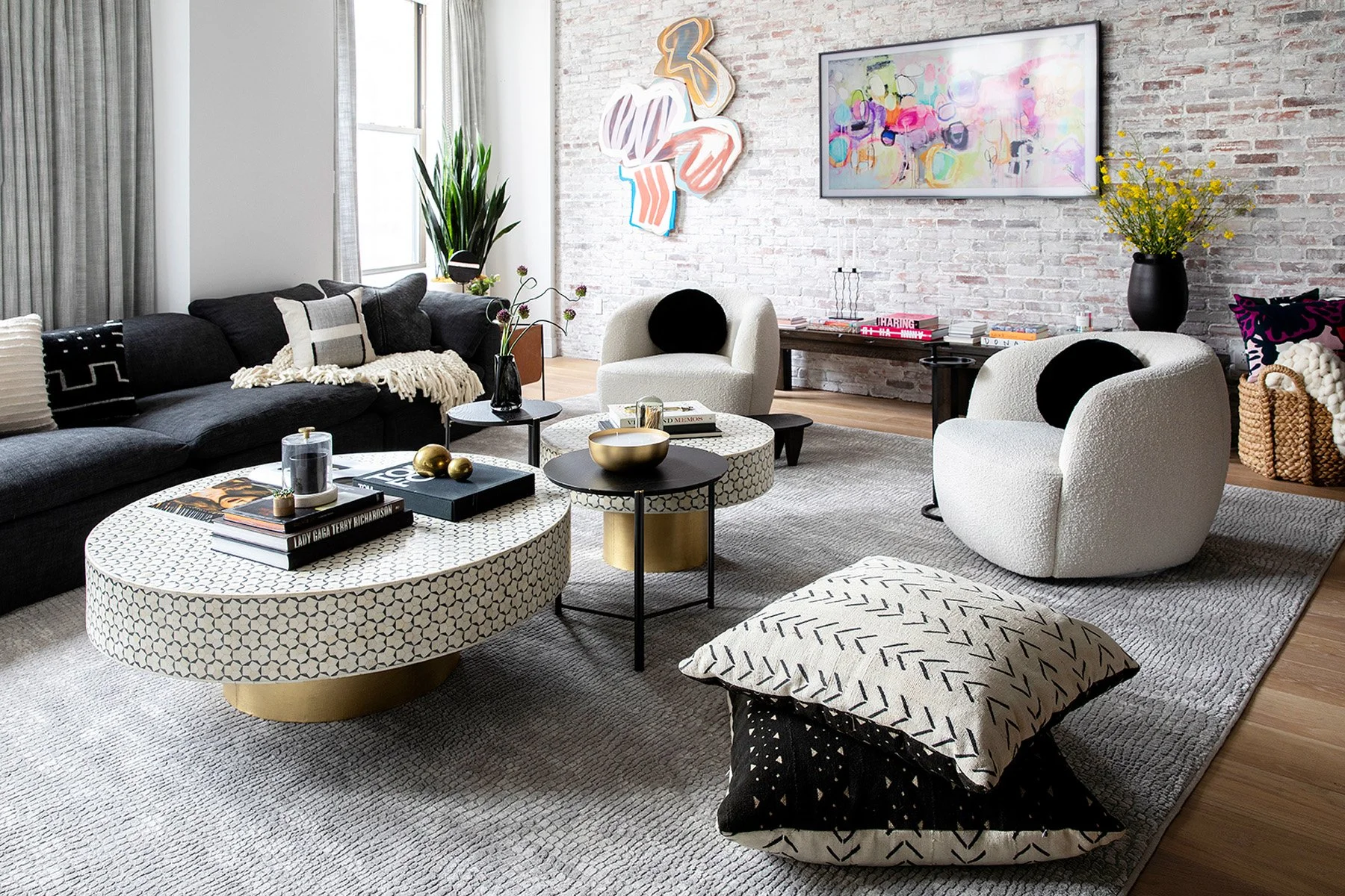
At Studio Ness, we believe great design should do both. This means moving beyond surface-level decorating and focusing on strategic decisions that increase real, appraisable value. From custom millwork that transforms vertical space into “found” square footage, to smart layout shifts like Junior-1 conversions, the right design choices can significantly impact your home’s worth.
In this guide, we break down the high-impact strategies NYC homeowners can use to maximize ROI: without sacrificing lifestyle. From micro-luxury upgrades in kitchens and baths to must-have amenities like in-unit laundry, these are the design moves that buyers notice - and pay for.
Because in a city like this, your home shouldn’t just be beautiful. It should work as hard as you do.
Interior Designer Cost in NYC (2026 Guide)
Interested in working with Studio Ness (or another designer)? There are a few ways firms bill for their services, start here to to find out more.