NYC Loft Transformation (Part 3)
Intro
Designing a home that works beautifully and feels beautiful means giving just as much thought to the private spaces as the public ones. In this final chapter of our 3 part Meatpacking Loft series, we’re diving into how intentional space planning transformed a dated floor plan into a smart, serene sanctuary for a growing family. If you missed the previous posts detailing this loft transformation, click here for part 1 and click here for part 2. From carving out bedrooms and a homework zone, to sneaking in a full laundry room and powder bath, this part of the renovation was all about thoughtful architecture—and a little creative risk-taking.
From Loft to Family Home: Defining the Zones
When we first saw this Meatpacking District loft, it had been converted into a residential unit back in the 1990s. At the time, the layout prioritized openness, but didn’t make sense for how our clients—a young family—live. We needed to find space for:
A spacious primary suite
Two additional bedrooms for the kids
A dedicated guest bath, powder room, and laundry room
Smart storage and circulation
We spent nearly a month in AutoCAD, exploring options that respected existing building systems (like risers and plumbing) while still pushing the boundaries of what this NYC apartment could become.
The Final Plan: Three Distinct Zones
We landed on a clean and efficient T-shaped hallway layout that clearly defines three functional areas of the apartment:
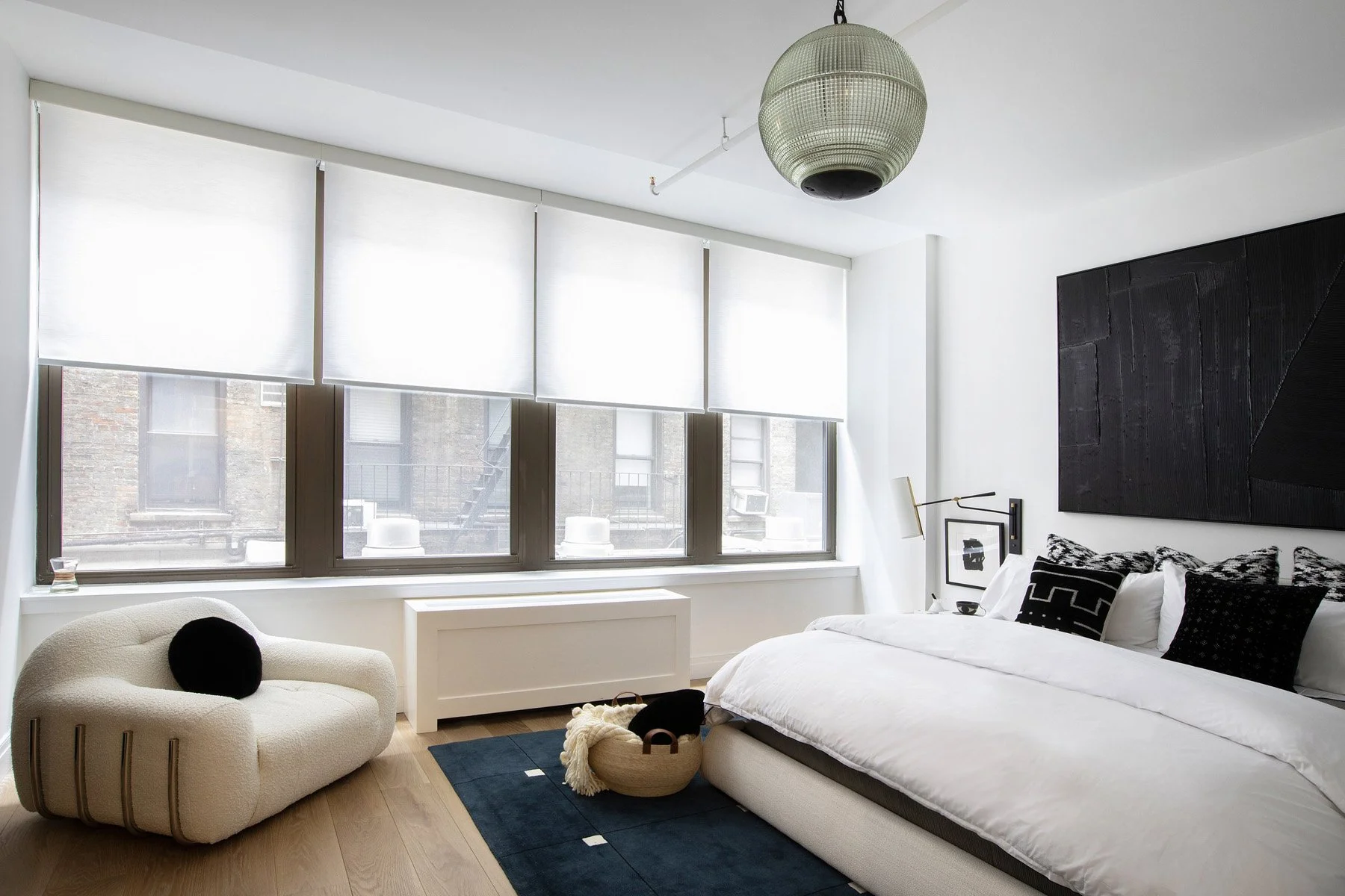
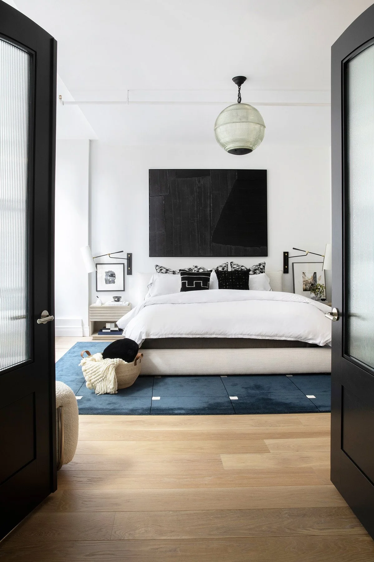
Zone 1: Private Primary Suite (Right off the Entry)
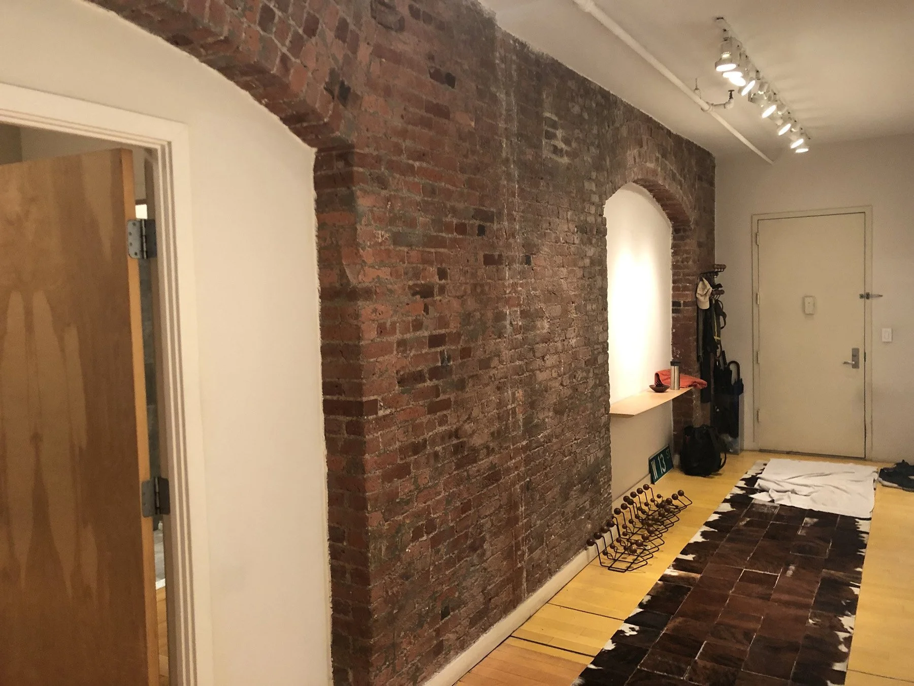
The primary suite stayed in its original location but was reorganized to feel more purposeful. We reoriented the bedroom entrance utilizing the existing brick archway, improved closet flow, and upgraded the ensuite bath. By keeping it tucked to the side, the suite feels like a retreat without sacrificing easy access. The client’s father was able to craft a beautiful set of french doors to perfectly fit into the archway, taking advantage of and highlighting the beautiful details. Blending new and old.
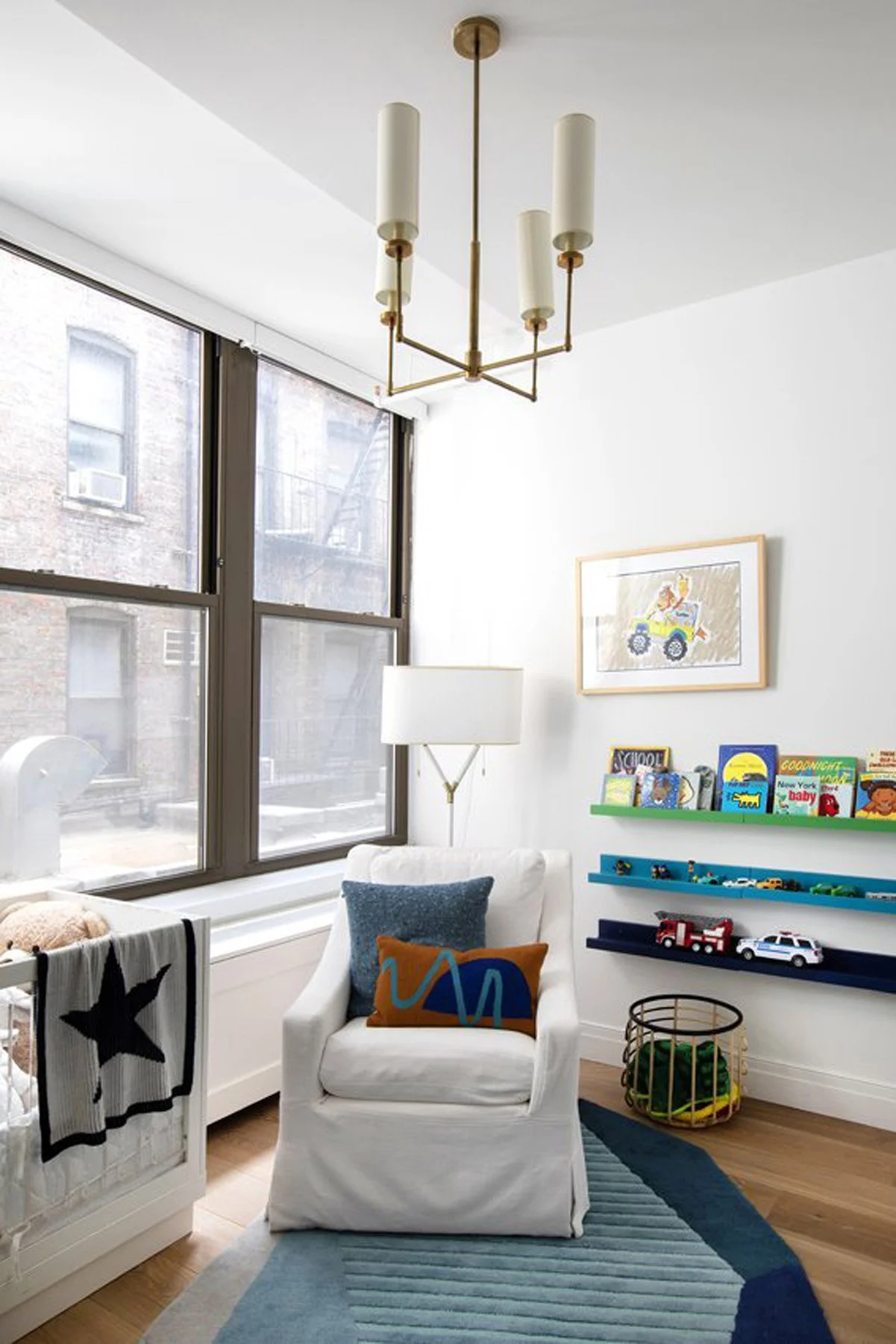
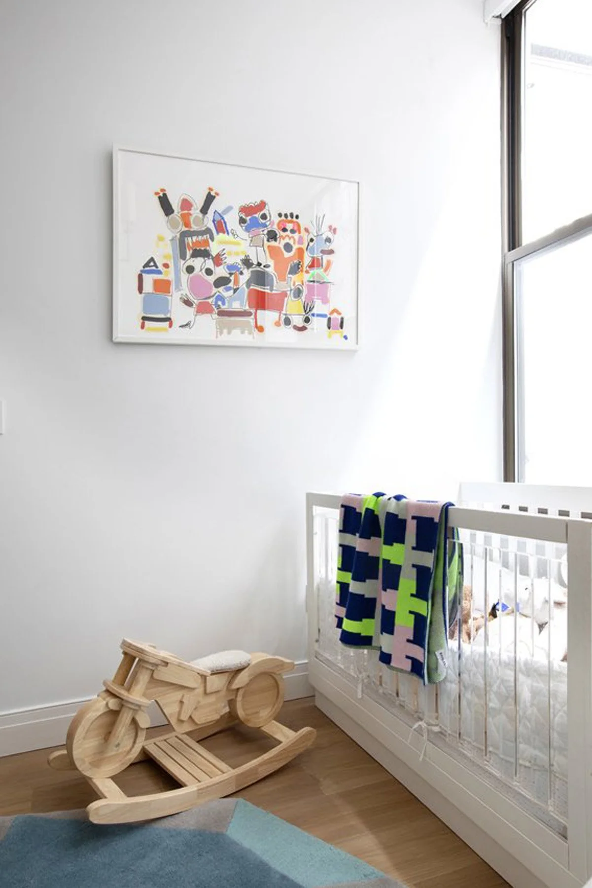
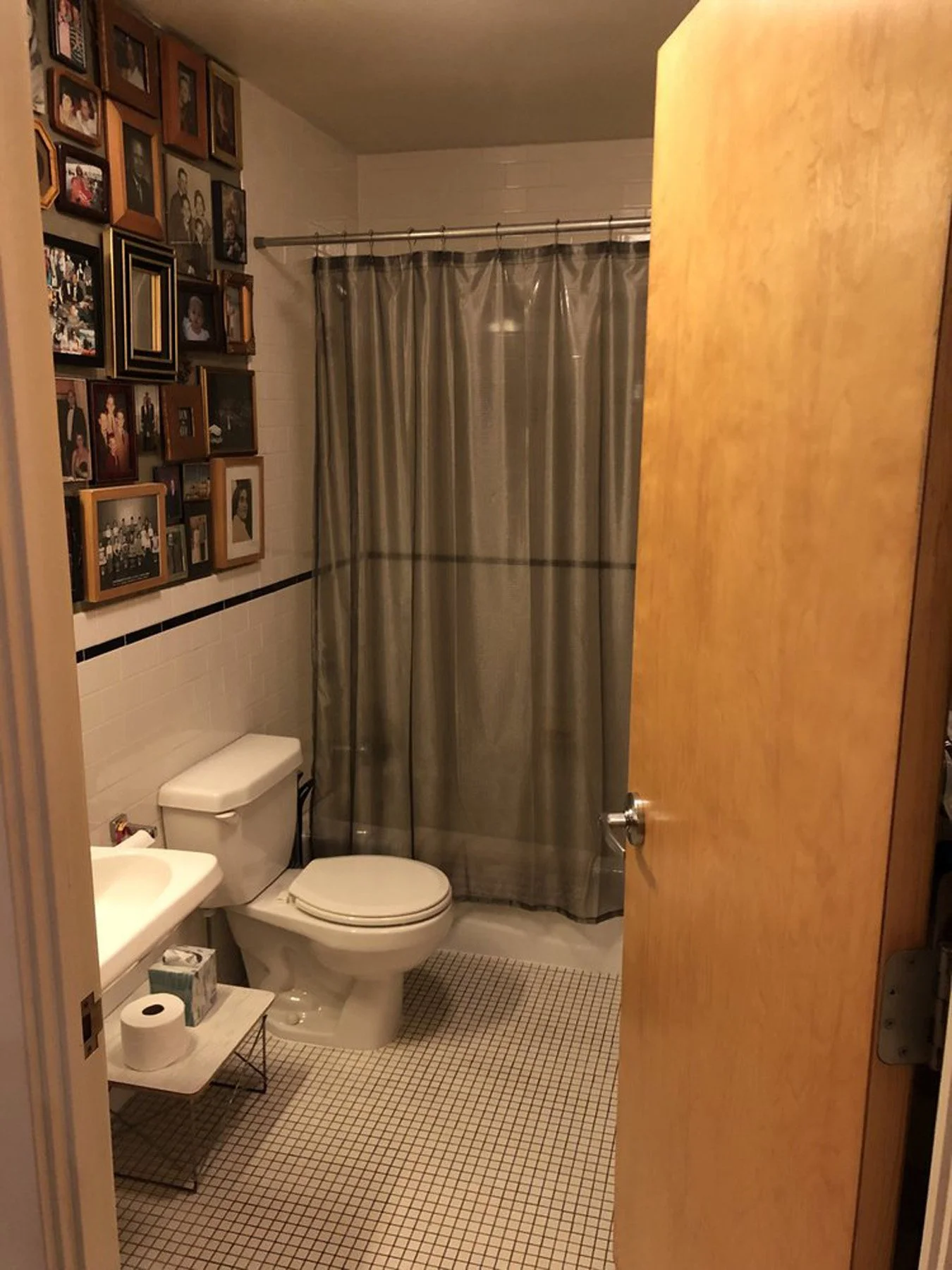
Zone 2: Kids’ Bedrooms + Laundry + Shared Bath (Center Core)
In the heart of the apartment, we designed two bright kids’ bedrooms and a flexible shared hallway. Between them? A compact homework zone and across the hallway, a perfectly sized kids bathroom and a large laundry room—a total luxury in Manhattan. We even fit in a beautiful powder room, cleverly converted from an underutilized closet space, tucked off the front hallway
Zone 3: Entertaining + Living (Open Loft End)
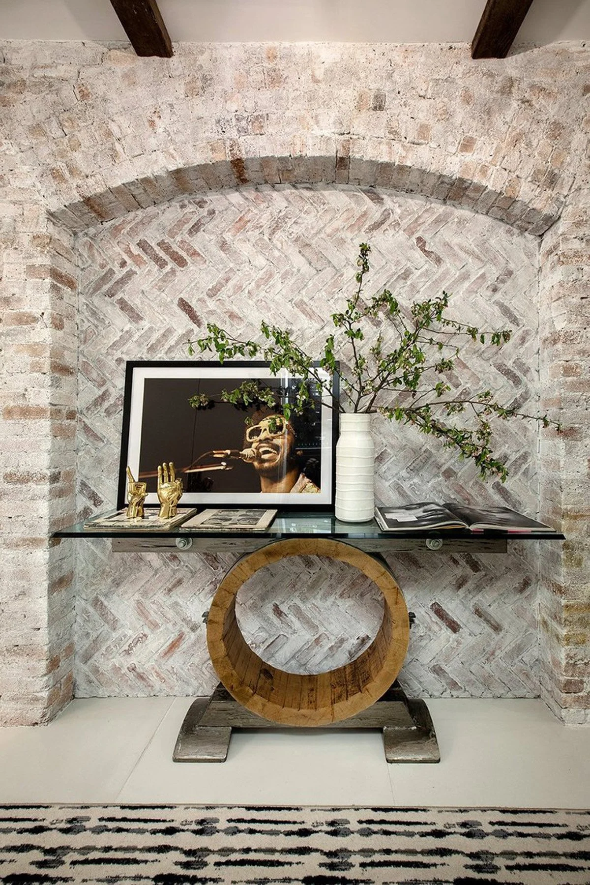
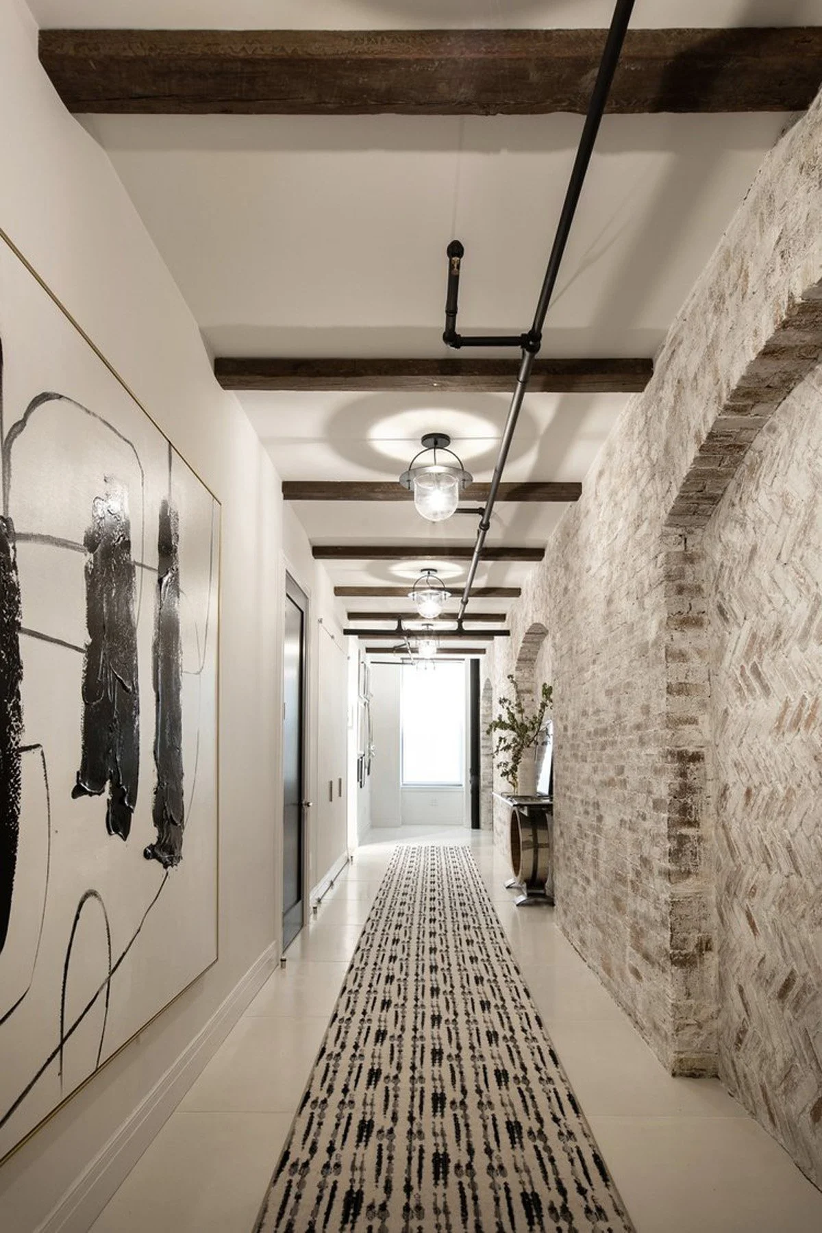
We discussed this area in Part 1 and Part 2, but in the context of space planning, what makes this zone work is how it’s connected via a long hallway lined with arched brick and reclaimed wood beams, offering drama and cohesion. The hallway was a dream of the client who was looking for a dramatic entry point.
The Hallway: Circulation with Purpose
At the core of the floor plan is a wide, gallery-style hallway that links every zone. This is no mere transition space it’s a design moment. We:
Whitewashed the original brick to brighten the entry without losing historic character. This may be controversial, but the original brick color was dark and made the front area feel tight and enclosed. The new finish highlighted the beauty of the brick and the architectural elements of the archways.
The century-old archways had been infilled with white painted drywall, blasphemous. We took an inspiration walk around the neighborhood and took note of infilled windows and doors on the industrial remnants of the past and took inspiration for our herringbone brick layout that feels more appropriate and compliments the existing brick beautifully.
Installed large-format Concrete Collaborative tiles to ground the palette. The oversized light concrete pavers hold up to everything this busy family can toss at it.
Brought in century-old reclaimed beams, sourced by the client and her father, for warmth and storytelling; we were hoping to expose the original beams in the space, but our firecode was not flexible to allow us to show them off.
Added pendant lighting with vintage lines and glass for repetition and rhythm
The result? A breathtaking visual axis that pulls your eye from the front door straight to the windows beyond.
Materiality & Mood: Where Old Meets New
Throughout the apartment, we kept finishes consistent, blending the industrial DNA of the building with the softness of a modern family home:
Wide-plank oak floors replaced old maple throughout the bedrooms and living areas
Concrete tile grounded the entry and powder bath
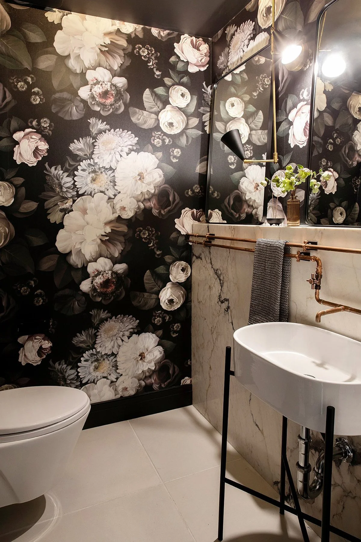
In the powder room, we embraced a sense of drama with Ellie Cashman’s oversized floral wallpaper and exposed copper pipework for the sink
Natural light was preserved wherever possible, especially in the kids’ rooms, which face a shared NYC lightwell
Planning Around Real Life
Space planning is about more than walls and doors—it’s about how a home feels. This layout now works for early mornings, playdates, after-dinner cocktails, and everything in between. And as the family grows, the space can grow with them.
Looking Back
As we reviewed earlier layout options, we saw some wild ideas—ones we still love in theory—but ultimately landed on a plan that balanced budget, feasibility, and long-term flexibility. That’s what great design is: listening, refining, and knowing when to take the leap.
To see the previous posts about this dramatic loft transformation, click here for part 1 (living room) and click here for part 2 (kitchen).
View the full project portfolio feature here.
Have a loft that you need help renovating? Let’s get together and find out how we can help.